Combobox

Markup: {{combobox}}

Quick start

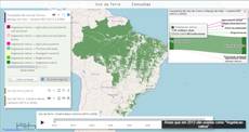
The example below, running in the Mappia calculator - click it to run it live. Full-size picture

  1. Run it

    Click the picture: the map opens right here and runs the example. Nothing is saved, and nothing to install.

  2. Try it
    • Open the list and pick 300: after the countdown, only the forest above 300 t/ha of biomass stays teal.
    • Pick 100: lighter forest joins in, and the legend reads Above 100 t/ha.
  3. Make it yours

    Copy the query, change it - the key parameters are below - and run it again in the playground, or paste it into the Mappia editor to save it as your map.

  4. More ways to use it

Key parameters

ParameterExampleWhat it does
data[["200"],["100"],["300"]]The entries, each a one-element array. The text shown is the value stored; a second element is ignored.
idlevelNames the choice: read it as inputs.id['level'] in beforeCalc, and by position (inputs[0] here) inside expression.
fieldLabelAbove (t/ha)Label shown at the left of the list.
editabletrueLets the user type to jump to an entry. Only values in the list are accepted (default false).
width160Width of the list in pixels (default 190). The layer panel is about 300 pixels wide, label included.
onSelectonLevelPickedA function in the layer’s functions, run on each pick with (combo, record, index). The layer recalculates anyway.

Every parameter, with its type and default, is in the reference at the end of this page.

Complete example

The query 23 lines · runs as is
// Combobox: pick a value from a list. data is a list of one-value entries - the list shows the value itself;
// the input holds the selected value (the first entry until the user picks another).
[
  {
    title: "Forest biomass above a chosen level",
    name: "CSR:biomassa_baccini_bioma_am",
    source: "calculate",
    opacity: 0.85,
    visibility: true,
    paramsButtonConfig: [{ type: "query", pressed: true }],
    descriptionHtml:
      "{{combobox|id=level|fieldLabel=Above (t/ha)|editable=false|width=160" +
      '|data=[["200"],["100"],["300"]]}}', // one value per entry: the list shows the values themselves
    beforeCalc: function (inputs) {
      this.setCalculateLegend([
        { color: [22, 160, 133], value: 1, title: "Above " + inputs.id["level"] + " t/ha" },
      ]);
    },
    expression: function (layersVals, inputs) {
      return layersVals[0] >= parseFloat(inputs[0]) ? 1 : this.nullValue;
    },
  },
];

More examples

Other ways to use Combobox, each a complete query that runs as is - like the one above.

Pick the map

The list switches which map the layer shows - one layer, three maps of the Amazon, changed with changeLayers when the reader picks.

Click the picture to run it live. Full-size picture

The query 25 lines · runs as is
// Pick the map: the list switches which map the layer shows - one layer, three maps of the Amazon, changed with changeLayers when the reader picks.
// Every map the layer may show is declared: the first in name, the others in otherNames.
// onSelect runs on each pick with (combo, record); record.get("value") is the text picked.
[
  {
    title: "One layer, three maps",
    name: "CSR:biomassa_baccini_bioma_am",
    otherNames: "CSR:biomassa_inv_br_redd,CSR:altimetria",
    source: "calculate",
    opacity: 0.8,
    visibility: true,
    paramsButtonConfig: [{ type: "query", pressed: true }],
    descriptionHtml:
      "{{combobox|id=shown_map|fieldLabel=Map|editable=false|width=170|onSelect=showMap" +
      '|data=[["Forest biomass"],["Carbon stock"],["Elevation"]]}}' +
      "{{legendhtml}}",
    functions: {
      showMap: function (combo, record) {
        var maps = { "Forest biomass": "biomassa_baccini_bioma_am", "Carbon stock": "biomassa_inv_br_redd", "Elevation": "altimetria" };
        var map = maps[record.get("value")];
        this.changeLayers([{ name: "CSR:" + map, styles: map + "_1", index: 0 }]); // a map's default style is <map>_1
      },
    },
  },
];

Customize it

Values are text

The value is the selected entry as a string, "300", so convert it with parseFloat before comparing numbers. The first entry is selected when the map opens: put the default first. The list picks one value; there is no multiple selection.

Show names, compute with numbers

Because the text shown is the value stored, list readable names and translate them inside expression. A literal written inside the function is fine there:

descriptionHtml:
  '{{combobox|id=forest|fieldLabel=Forest|editable=false|data=[["Sparse"],["Dense"]]}}',
expression: function (layersVals, inputs) {
  var limits = { Sparse: [0, 150], Dense: [250, 99999] }; // t/ha
  var range = limits[inputs[0]];
  return layersVals[0] >= range[0] && layersVals[0] <= range[1] ? 1 : this.nullValue;
},

Run code when the user picks

onSelect names a function in the layer’s functions. It runs on every pick with (combo, record, index) and this = the layer; record.get("value") is the chosen text. Use it for side effects, for example swapping the map the layer reads when the list holds map names:

functions: {
  onRegionSelected: function (combo, record, index) {
    this.changeLayers({ name: "CSR:" + record.get("value"), index: 0 });
  },
},

Select from code

Ext.getCmp("level").getValue() reads the selection and Ext.getCmp("level").setValue("300") changes it. Setting it from code does not count as a pick, so the layer does not recalculate: add an InputManager and call its forceRecalc() after.

Add the legend and the opacity

{{legendhtml}} puts the map legend in the panel, next to the list, and the layer’s opacity (0 to 1) sets how transparent it starts. See Legend and opacity slider.

Pitfalls

  • data=[["01", "January"]] shows and stores 01: the second element is ignored.
  • onSelect is looked up only in the layer’s functions, never among global functions.
  • Inside expression there is no inputs.id; read the choice by position. Legend colours in setCalculateLegend are [R, G, B] arrays.

Real maps that use it

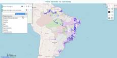
Simple Combobox Example

Simple Combobox Example

Simple Combobox Example

Filter Style

Filter Style

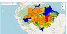
AMAZONES - Brazil nut

AMAZONES - Brazil nut

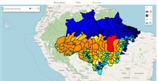
AMAZONES - Fire

AMAZONES - Fire

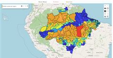
AMAZONES - Non-timber rubber

AMAZONES - Non-timber rubber

Mitigation option project

Mitigation option project

SimAmazoniaINFRA - Deforestation and CO2 scenarios

SimAmazoniaINFRA - Deforestation and CO2 scenarios

Reference: the parameters used here

Generated from the platform source. Every entry, searchable, is in the API reference; the raw data is api.json. Open an entry for its description, parameters and example; # links to it.

combobox · pick from a list (input)

Combobox11 entries

Written in a layer's descriptionHtml as {{combobox|parameter=value|...}}

It creates an input of ComboBox tool where the value is selectable from a list.
Usage: '{{combobox}}' or examples.
This button is created from Ext.form.ComboBox for customized properties click on API here.

data

Array.<Array.<String>>= undefined# Defines the data that will be displayed in the Combobox.

Defines the data that will be displayed in the Combobox.

|data = [["Val_1"], ["Val_2"],..]|

editable

Boolean= false# Determines if the Combobox is editable.

Determines if the Combobox is editable. That is, if it allows the user to type inside the input field. Set it true to allow it, false otherwise.

|editable=true|

fieldLabel

String# Defines a label for the Combobox.

Defines a label for the Combobox. It will be shown at the left of the Combobox, by default.

|fieldLabel=This is the field label|

getValue

function() : String# Returns the currently selected value (the text of the chosen data entry).

Returns the currently selected value (the text of the chosen data entry). Call it on the component (Ext.getCmp(id) or a getid= reference); inputs.id[ID] already holds the same value.

Returns The selected value.

var region = Ext.getCmp('region_combo').getValue();

hideLabel

Boolean= false# Defines if the label of the Combobox should be displayed.

Defines if the label of the Combobox should be displayed. Set true to hide the label, false to show it.

|hideLabel=true|

id

String# Defines the id to identify the object.

Defines the id to identify the object.

|id=legend_combobox|

labelStyle

String# Defines the style of the label.

Defines the style of the label. You can use CSS to style the label element.

|labelStyle=font-weight: bold; color: red;|

onSelect

function# Defines a callback run when the user picks an entry.

Defines a callback run when the user picks an entry. It receives the Ext select event arguments (combo, record, index) — read the chosen text with record.get('value') — and this is the layer. The value is resolved as a key of the layer functions object or, failing that, the text itself is evaluated as a function (a body or a full function(){...}); unlike the other callbacks it does NOT look for a global (setQueryGlobalProperties) function of that name. PS: the layer is recalculated on select anyway; use onSelect for side effects such as changing layers or updating a window.

|onSelect=onRegionSelected|
functions: {
    onRegionSelected: function(combo, record, index) {
        this.changeLayers({name: 'CSR:' + record.get('value'), index: 0});
    }
}

setValue

function(value)# Selects an entry from code.

Selects an entry from code. Pass one of the data values; it does not fire select, so call forceRecalc() on an InputManager (or fire the event) when the layer must be recalculated.

value String
One of the values listed in data.
Ext.getCmp('region_combo').setValue('Protected Areas');

value

String# Value stored in inputs.id[ID] (and inputs[i]): the selected entry of data as a string (the first entry is selected initially).

Value stored in inputs.id[ID] (and inputs[i]): the selected entry of data as a string (the first entry is selected initially). The layer recalculates on the combobox select event (user choice).

{{combobox|id=region_combo|fieldLabel=Region|data=[['Municipalities'],['Protected Areas']]}}
beforeCalc: function(inputs) {
    var region = inputs.id['region_combo']; // 'Municipalities' or 'Protected Areas'
}

width

Number= 190# Defines the width of the combobox in pixels.

Defines the width of the combobox in pixels.

|width=250|

legendhtml · legend of the calculated map

LegendHtml7 entries

Written in a layer's descriptionHtml as {{legendhtml|parameter=value|...}}

Create a tool with the map legends at any place of the query description.
Usage: '{{legendhtml}}'

autoWidth

Boolean= true# Set true (default) to let the legend panel take the width of its container; set false to give it a fixed width.

Set true (default) to let the legend panel take the width of its container; set false to give it a fixed width.

|autoWidth=false|width=250|

filterLayers

Array.<Number>= null# Defines an array of indexes of layers to be included in map legend (from 0 to quantity of layers).

Defines an array of indexes of layers to be included in map legend (from 0 to quantity of layers). If not defined, all layer legends are shown by default. Otherwise, only the listed indexes are included.

Ex: A composed layer with three maps: name: "CSR:estados,CSR:roads,CSR:municipalities", If 'filterLayers=[0,1]' is defined in the layer object only the legends of 'CSR:estatdos' and 'CSR:roads' are shown.

|filterLayers = [1,2]|

id

String# Defines the id of the legend panel component (Ext.getCmp(id)), e.g. to show()/hide() it or to find the legend entries inside it.

Defines the id of the legend panel component (Ext.getCmp(id)), e.g. to show()/hide() it or to find the legend entries inside it. Generated when omitted. Other GeoExt.WMSLegend/Ext.Panel configs (cls, style, hidden, useScaleParameter, autoWidth...) are passed through.

|id=main_legend|

legendId

String= null# Defines the legend container id.

Defines the legend container id. You can use this id to toggle each legend filter individually.

|legendId=WIDGET_OBJECT_ID|

preventClick

Boolean= false# Defines if the user can filter the maps categories by clicking on the legend.

Defines if the user can filter the maps categories by clicking on the legend. Set it true to ignore the legend click, false otherwise.

|preventClick = true|

reverseLegend

Boolean= false# Defines if it should sort the legend on the decreasing order.

Defines if it should sort the legend on the decreasing order. Set it true to use the decreasing order, false otherwise.

|reverseLegend = true|

useScaleParameter

Boolean= false# Set true to request a new legend image from the server whenever the map scale changes (GeoServer SCALE parameter), for styles that depend on the scale.

Set true to request a new legend image from the server whenever the map scale changes (GeoServer SCALE parameter), for styles that depend on the scale. Off by default: the legend is generated once and reused, which is faster and keeps the click-to-filter behaviour stable.

|useScaleParameter=true|

Layer properties

LayersProperties1 entry
Keys of a layer object: which map it shows (name, source, styles), how it looks (title, opacity, visibility) and how its row and panel behave.

opacity

Numeric= 1property# Define the opacity of the Layer.

Define the opacity of the Layer. The opacity is a value between 0 and 1 that is a scale for its transparency. 0 is completely transparent. 1 is completely visible.

[
 {
   title: 'Example of opacity in a Layer',
   color: '#666699',
   elements: [
     {
       title: 'This Layer has its opacity set to 50% of the original visibility',
       name: 'CSR:geologia',
       source: 'local',
       visibility: true,
       opacity: 0.5,
     },
   ],
 },
]